Redesigning royalty registration
Redesigned the dense registration flow songwriters must complete to collect mechanical royalties through UX research methodologies. Led the company's new design system creation during its migration to React.
Context
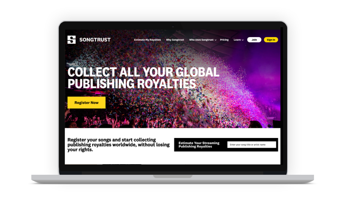
Songtrust was founded in 2011 as a part of Downtown Music Holdings to help independent artists and music agencies collect global publishing royalties. I was hired as part of a revamp for the application - the development team was moving the legacy site to React to improve performance and fix the codebase, while the art department and marketing team launched a new visual identity and brand system to update the look. My task was to create a new design system using this identity, while improving the experience for the entire application.
The problem
Songtrust exists so songwriters can collect the mechanical royalties they're owed. To collect them, a songwriter has to register their compositions, which includes declaring every writer, every publisher, and every ownership split, for every song. When musicians fill it out incorrectly, the money doesn't arrive, or it arrives at the wrong person. We only hear about these errors directly from the musicians - the collection societies had no way of sending us feedback at that time.
This registration form was the core product. It was also dense, long, and full of terminology most songwriters had never encountered (because most songwriters are not rights administrators). And, they only came back a few times a year. A songwriter registers only when they have a final recording, which can be just a handful of times a year, sometimes less. Whatever they learned last time was gone by the next visit.
What I did
Building the foundations: A real design system
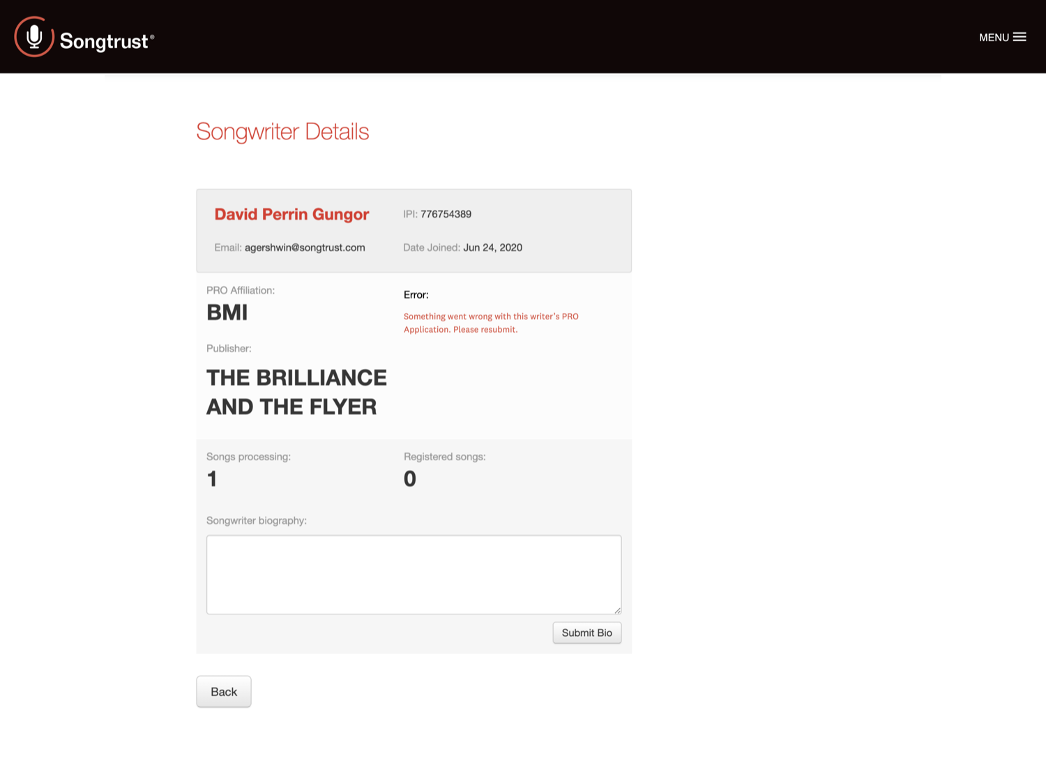
When I started, the Figma file had a few components and a lot of screenshots from the existing site, which wasn't great for dev handoffs. I began with a site audit and heuristic evaluation, carefully documenting every page live on the site compared to the pages in the Figma document, adding to the screenshots, and marking areas that didn't meet basic design and usability heuristics. When I am the sole designer (and can't do a proper evaluation with multiple evaluators) I like to use a combination of Nielsen's heuristics and Gerhardt-Powal's cognitive engineering principles. From there, I could decide what gets a 1:1 replacement with updated components, and what sections require more information to improve usability.
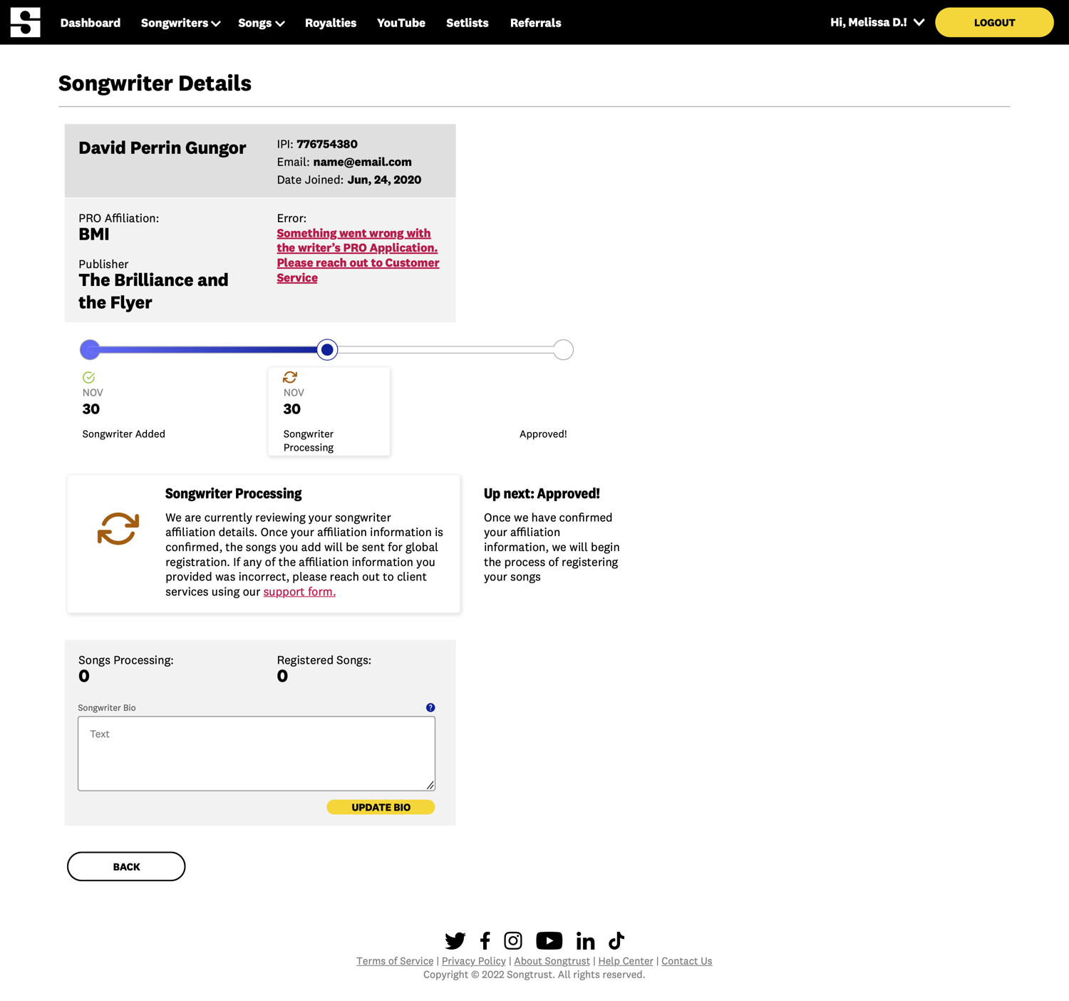
Designing for memorability over efficiency.
Most enterprise software optimizes for expert efficiency: assume daily use, reward accumulated familiarity, build density and shortcuts for the people who live in the tool. You're building a balance for the new user who will learn quickly, and the power user who will remember the platform. For Songtrust, optimizing for expertise assumed users would accumulate it, and ours structurally couldn't; the gaps between sessions were too long. So I designed for memorability instead: the interface had to be relearnable from a near-cold start, every time, without making an experienced user feel condescended to.
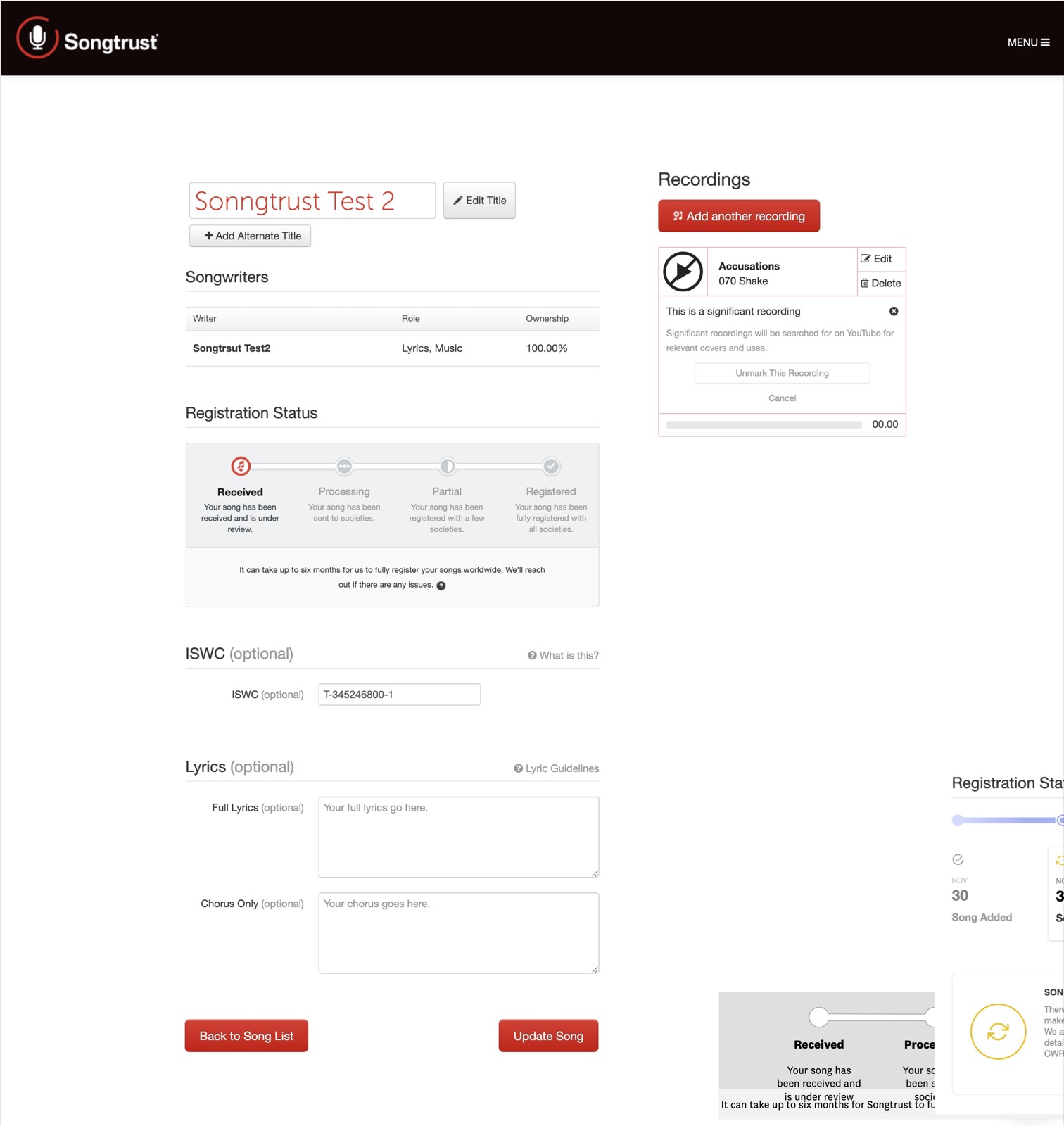
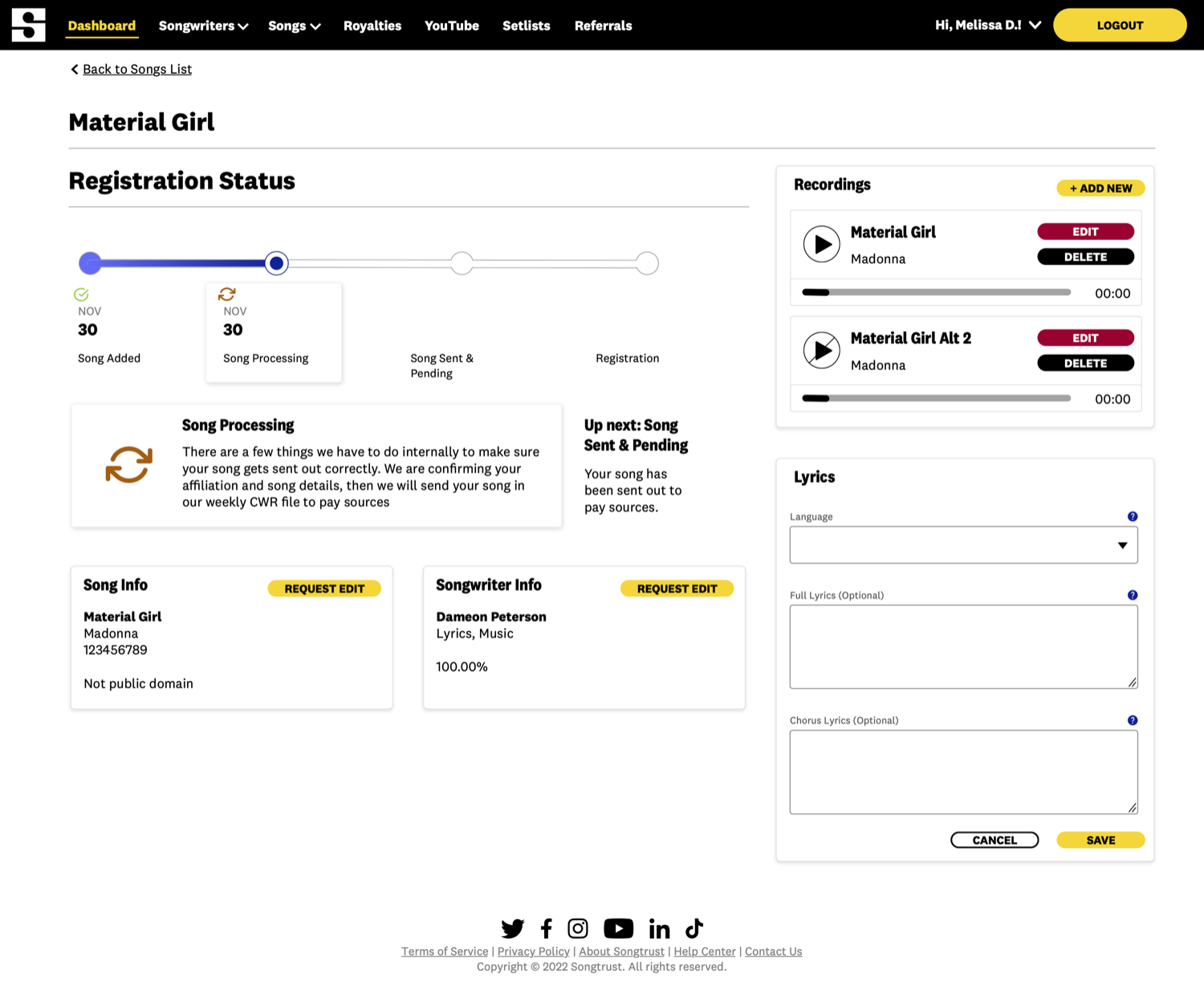
The last thing I touched
UX Research: improving the core product
Late in my time there, I was given a budget for a spring UX research, and I used it to focus on where royalty registration was actively frustrating users, even after the form improvements? I built the study in parallel tracks:
- Build domain understanding first. Our intern was not a musician, or a professional from the music industry. She came from a social worker background, looking to make her way into tech research. I had her start inside the product - reading the FAQs and help docs, walking through every screen and documenting her questions and points of confusion.
- Interview internal experts. Together, we wrote and ran interviews with the product manager, and members of the sales and marketing teams to gain their understanding of how the product works, what they've heard as customer feedback and concerns when talking to potential users. This helped us map what the company believed the product solved, and where it knew the gaps were.
- Recruit real users. We set up a post-login message inviting users to opt into research and answer a short screener - how often they wrote and registered songs, revenue range, and if they were an individual songwriter, the admin part of a band, or part of an agency representing multiple artists - to segment who and how many to interview.
I designed the study around the person I was most concerned about: the solo musician doing this for the first time, alone, with their income depending on getting it right. Together with the intern, we got through internal interviews, the screener and collecting opt-ins, when my role was made redundant. I kept in touch with the intern - though the scope changed from the solo musician to agencies, she was able to successfully conduct interviews and gather information to present to the product manager to decide next steps for the application's development.