Redesigning melissadowell.com
A ground-up rebuild of this very site — retiring a hand-coded, hand-illustrated portfolio for a modern, accessible one built with Next.js, Claude, and Figma.
Context
This is a case study about the site you're reading. I rebuilt melissadowell.com from the ground up in 2026 — not because the old one was broken, but because it no longer matched the work I do now.
The old site
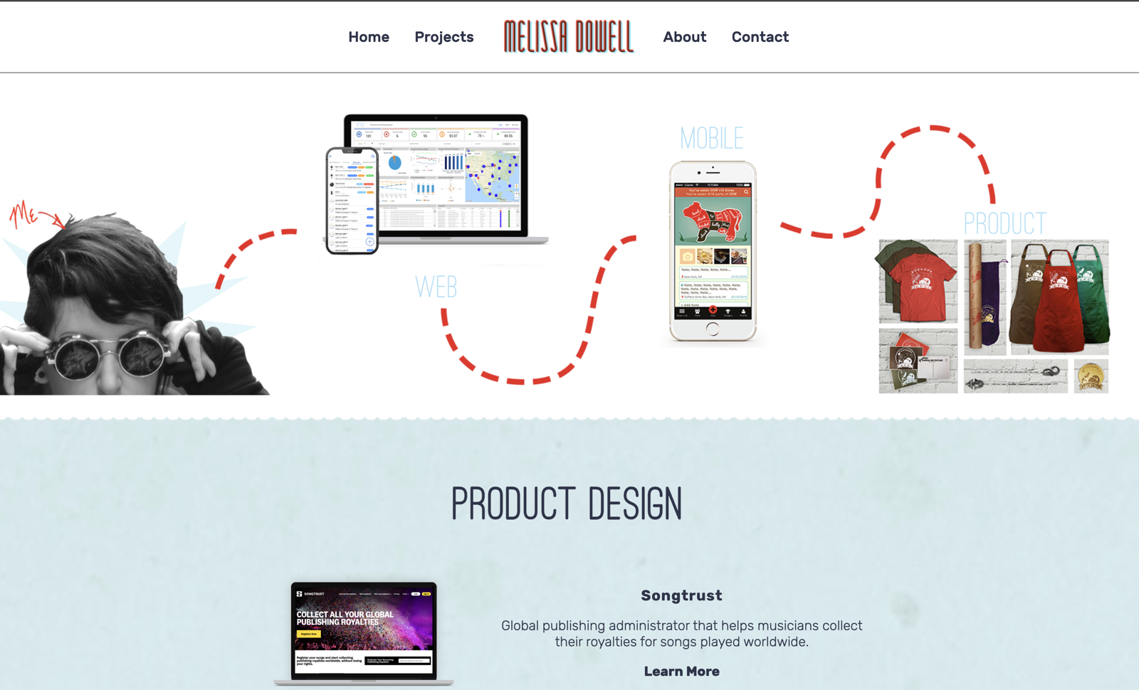
I built the previous melissadowell.com entirely by hand in Sublime Text. I hand-drew all the graphics, and I made it responsive without a single framework — just HTML, CSS, and JavaScript I wrote and maintained myself. It was a deliberate throwback to where I started: building websites by hand, before tools like WordPress existed. I'm still proud of it — that craft is real, and it's mine.
One detail I loved: a hand-animated red dashed line that drew itself across the header, connecting the “me” sketch to my web, mobile, and product work.
Why rebuild
But a hand-coded, hand-illustrated site has costs. Every change meant editing raw HTML across pages. The playful, illustrated identity — as much as I love it — increasingly spoke to a different role than the senior product-design work I do today. And the standards I hold my professional work to, especially around accessibility, deserved to show up in my own portfolio: proper semantics, keyboard navigation, screen-reader support, and light and dark theming.
I also wanted this rebuild to be a piece of the portfolio — a demonstration of how I work now.
The new site
The site you're on is built with modern tools, the way I build product today:
- Framework-based layout. Next.js and React handle structure, routing, and the case-study system, so content is easy to add and the whole thing stays maintainable.
- Built with Claude. I paired with Claude Code to go from idea to a working, accessible interface in about three days — designing in the browser, iterating in real time, and shipping the code alongside it.
- Refined in Figma. The visual system — type, color, spacing, and the red-and-cyan anaglyph motif — is designed and refined in Figma, then translated into design tokens in code.
- Accessible by default. WCAG AA color contrast, a full heading hierarchy, labeled landmarks, keyboard-navigable everything, and a light/dark theme that follows the system and can be toggled.
The one thing I kept from the old site is a wink to its identity: those red-and-cyan 3D glasses became the anaglyph theme that runs through this one.